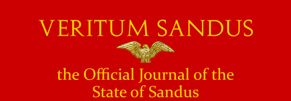
Veritum Sandus has been the official journal and leading national newspaper of Sandus since 7 November 2009 when we were founded to serve as Sandus’s prime news source. Over the years, we have been the medium to inform citizens, to share the politics and opinions of the Central People’s Government and of Sandum citizens, and to shape our national identity.
Today, for the first time since 2009, Veritum Sandus has been rebranded! We have a new logo and the Sandus.org website has received something of a facelift.

This move also requires something of a coming out. For years, we have translated our name—Veritum Sandus—according to Sandus’s constructed language, Sandum Latin, long defunct since late 2009. But we must admit that there is a name that makes more sense in Latin, Sandus’s third official and cultural language: “Sandus revered.”

Our newspaper’s former logo was crimson and gold, matching the historic national flags from 2009 to 2010 and their colours.

The new simplistic and minimally stylised logo uses the font Cormorant Garamond, the serif font most recently used in Sandum governmental business. As a nod to the past, the main title is bordered by the gold found in the old logo, while the subtitles are bordered by white. (This is rather hard to see on a white background.)
The Latin can be explained in many ways. In Latin, Sandus is grammatically neuter, meaning that the appropriate ending for the participle veritus is –um. But the phrase can be translated in other ways since the verb vereor (of which veritus is a participle) can be translated as “to fear, dread” or “to respect, revere, or stand in awe.” Other translations can be “Sandus Dreaded” or “Sandus, stood in awe of.”
But we like to imagine that we aren’t dreaded, and being stood in awe of is nice but a little hefty as a translation.
Leave a comment